Kansas City’s historical neighborhoods make up a large part of the city’s urban fabric and contribute to the city’s image as a whole. However, many historic houses and apartments in these neighborhoods are now 50 to 100 years old. Many are so dilapidated that they have been slowly falling apart on their lots from disuse, or they are demolished to make way for new construction. In either situation, the city loses a tangible part of its history and a part of the housing stock that is now more critical than ever to offer residents diverse housing options.
To retain some of the city’s history and provide more housing diversity, DRAW has designed projects located in several of the historic and Targeted Redevelopment neighborhoods with the City of Kansas City and the Historic Neighborhoods & Housing Services Department. Some of these historic neighborhoods include but are not limited to Key Coalition, Santa Fe, Marlborough, Manheim, and Blue Hills. The goal for the project was to develop designs for new, modernized traditional homes that are capable of being inserted onto vacant lots around the metro area to connect to and renew the historical fabric in these areas while giving the benefits of modern design in terms of construction, sustainability, etc. Both single-family and duplex residences were developed based on Kansas City’s traditional housing stock within the neighborhoods. The modern designs’ form, proportions, and spatial relationships were derived from their respective historical types, but updated the spatial organization and functions based on current needs and uses. Elements of the existing housing stock, such as front porches, complimentary materials, etc. were incorporated into the designs to maintain continuity from the old to the new.
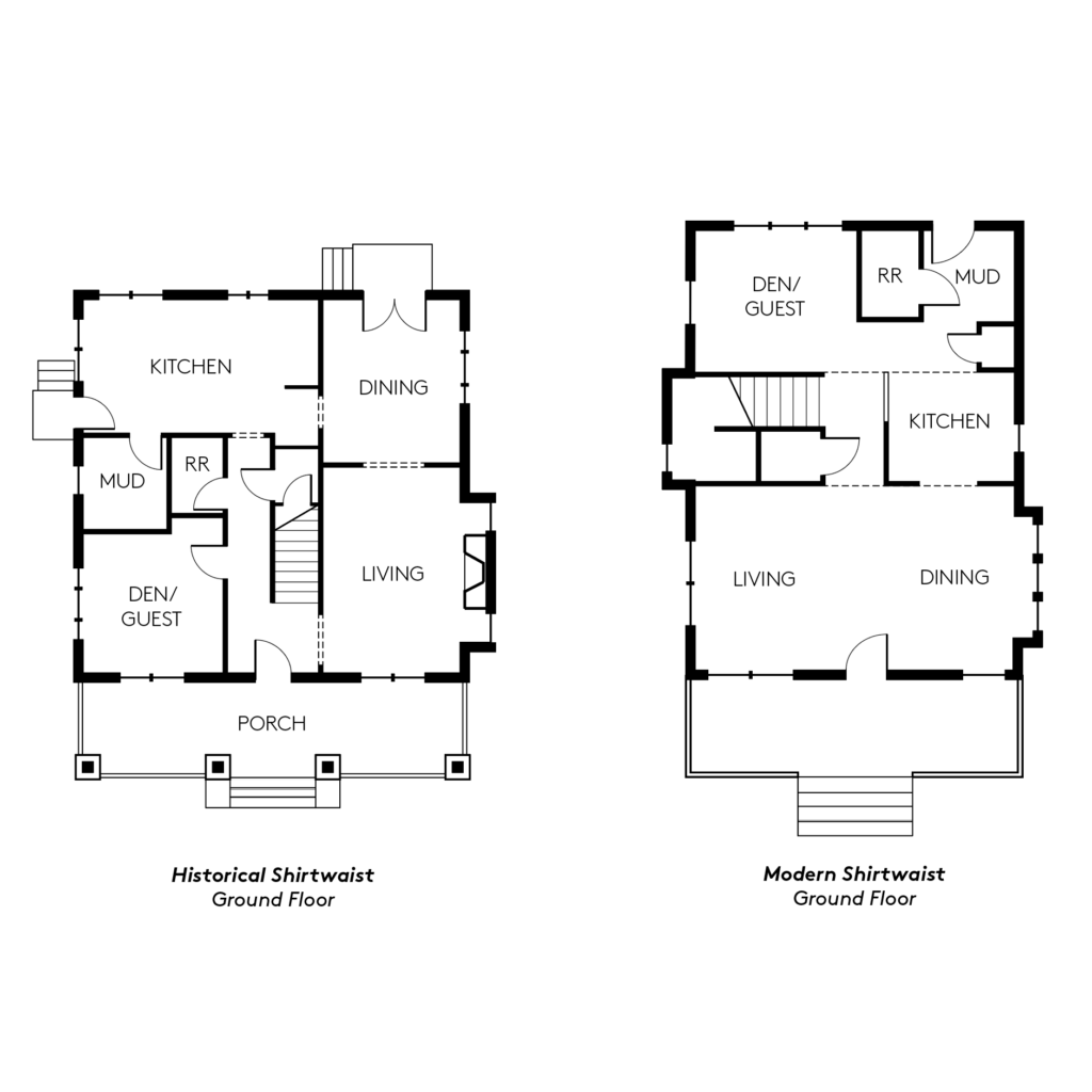
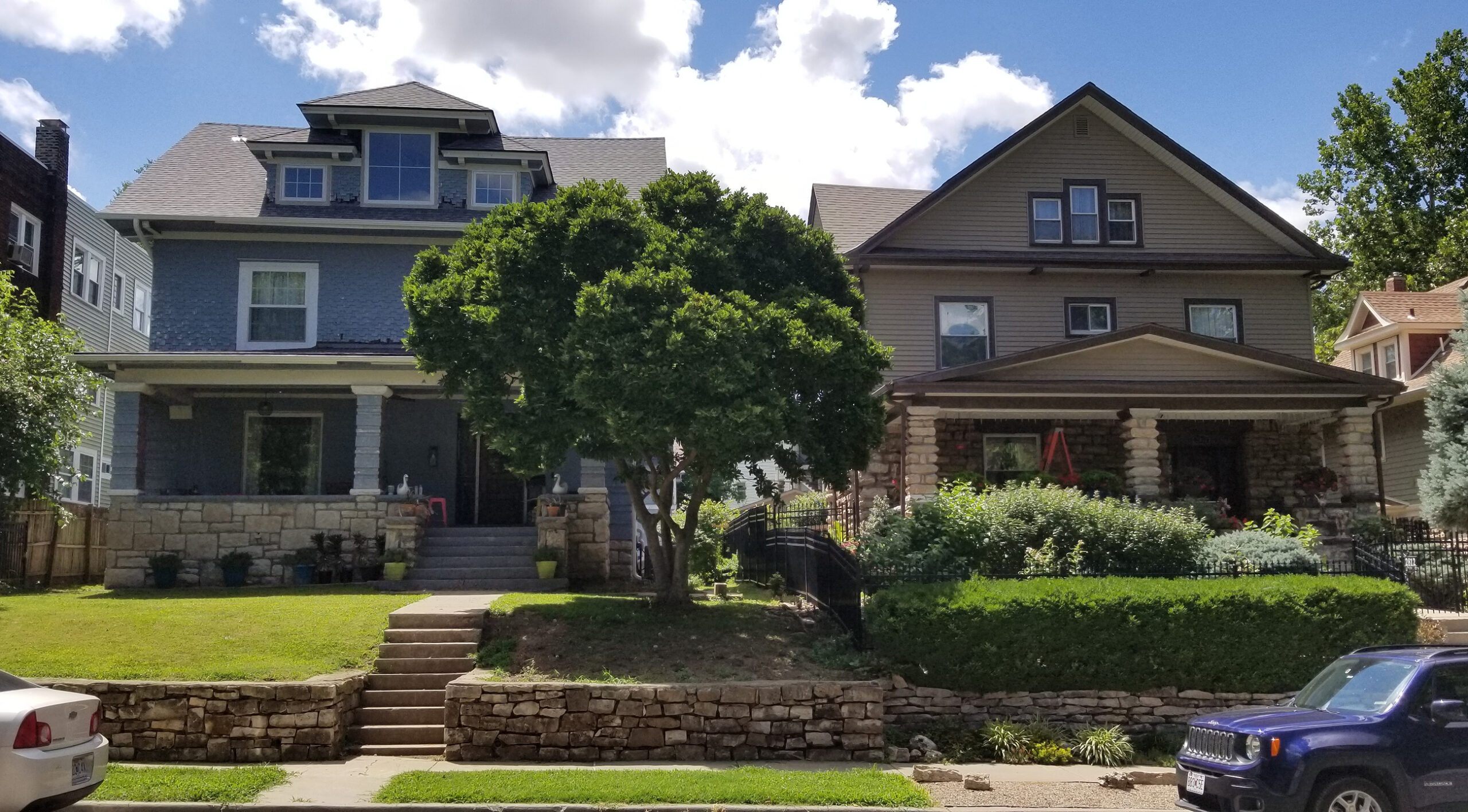
One of the most iconic housing types in Kansas City is known as the Kansas City Shirtwaist since it is a regional style that was primarily constructed during the city’s Arts and Crafts period (1900s to 1920s). The most notable feature of the Shirtwaist is the use of brick, limestone, or locally quarried stone used around the first floor of the building, while stucco or wood lap siding makes up the upper floor(s). A large front porch extends the entire width of the symmetrical façade and is typically made from the same material as the first floor. Usually, there are at least two stories, though sometimes three, with a steep, bellcast gabled roof that curves at the ends to form flared eaves. Inside, the living room, dining, and kitchen were all connected to serve as public spaces to welcome guests. More private spaces, such as a den/private guest space, powder room, etc. were divided from the public spaces by circulation, such as hallways and a staircase. The den/private guest space and living room were typically at the front of the house, while the dining room and kitchen was typically located towards the back. During the time, kitchens were a more utilitarian space that, due to poor ventilation, were often an uncomfortable and unhealthy environment to linger in. A nearby door allowed direct access to wood, water, ice, etc., that might be stored or brought in directly from outside. Essentially, how these spaces were used and their environments translated to their location within the traditional houses’ floor plans.
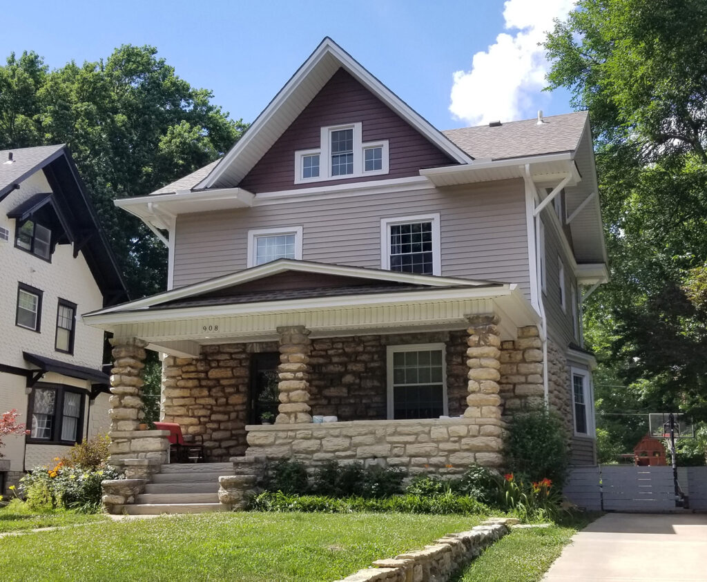
The Classic Kansas City Shirtwaist.
One of DRAW’s single-family prototype designs is a modernized version of the Shirtwaist. The overall design is approximately 1200sf with three bedrooms and two and a half bathrooms. The service spaces, such as laundry and bathrooms, are compacted into a “bar” that allows the main living spaces to open up and allow for more flexibility than the historical floor plan. The spatial relationships between the kitchen and dining room and the dining room and living room is maintained while the overall spatial organization is simply rotated 90 degrees in plan. This shifts the private den towards the back of the house so that the dining and living room can share an open space at the front since hard boundaries between rooms have slowly broken down to create more open layouts. The circulation spaces are still used as a dividing element between public and private spaces on the first floor, and the staircase is pushed to one side of the house in a way that is commonly found in shirtwaist houses. The kitchen, though still towards the back of the house, is more openly connected to the rooms at the front of the house since kitchens and their environment in the 1920s are significantly different than now. Kitchens are now used as another space to host guests since the advancement of air conditioning has allowed them to be more comfortable spaces to use. The simple, rotational move adjusts the spatial organization of the rooms to fit with how they are used and the standards of design in the 21st century while still preserving key spatial relationships and the iconic form of the historical Kansas City Shirtwaists.
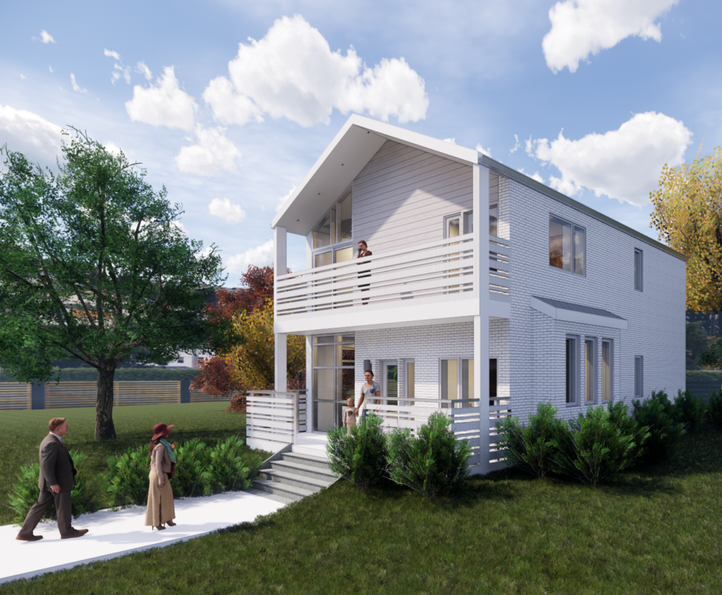
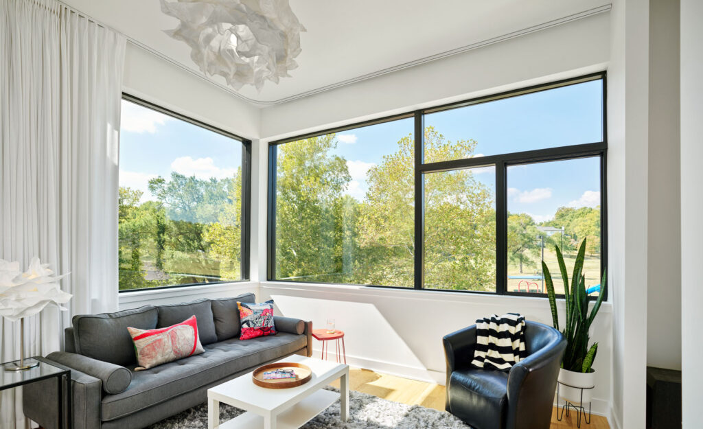
DRAW’s Modern Shirtwaist.
