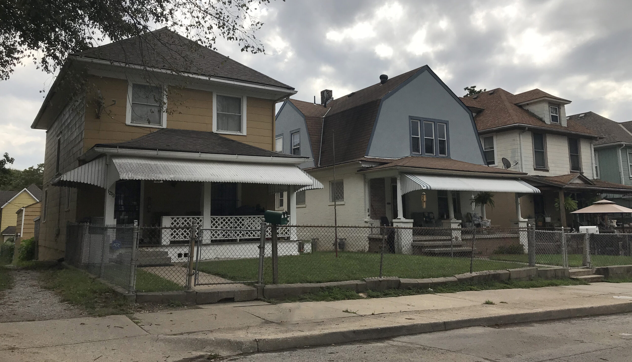
When Positive Impact Design is rooted in values of empathy and activism, it allows itself to be actualized at any variety of given scales and forms. Color is one such way that it can be applied. While seemingly a rather simple attribute, color in a singular sense contains a rich depth of psychological particularities, and as such is incredibly complex and nuanced in its relationship to other colors. Neighborhoods often evoke a feeling of coherence because of the colors seen throughout them, whether in the form of identical brownstone row houses or in the form of duplexes that are clad utilizing the same color palette. Positive Impact Design is integral to this because, as architects, we must treat a new site as the extension of the context around it, recognizing the overall sense of place and then acting to respond to it.
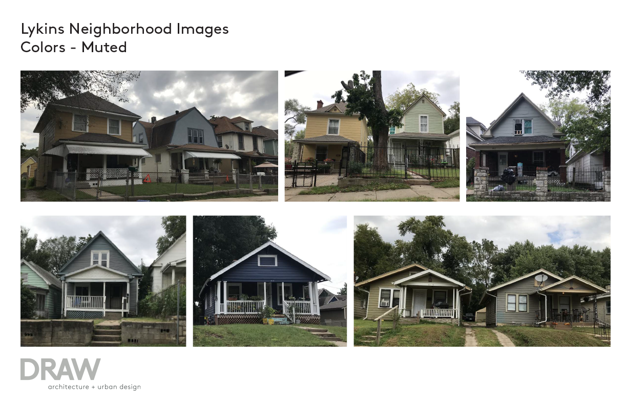
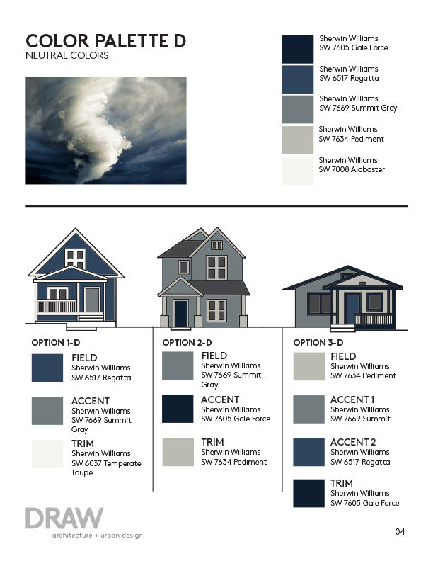
The Lykins Neighborhood Color Study was one example of how this could be enacted. Approached by the Lykins Neighborhood Association, DRAW was asked to conduct an analysis of the existing color palettes of the neighborhood and then devise a range of corresponding color palettes for when existing homes needed to be repainted. Homes undergoing rehab or new builders would then be able to use the research and schemes to give the neighborhood some cohesiveness while still catering to the wide variety of existing colors and cultures. Ultimately, both this initiative and its eventual enforcement were entirely of the Lykins Neighborhood Association, allowing them to take ownership of the process.